Aki's Flights
Aki's Flights is a native mobile application created for a local flight agency looking to expand it's horizon by providing its services to universal users who are on the go and may not always have time to visit the branches located in London.
role:
Product designer from conception to delivery.
Product designer from conception to delivery.
responsibilities:
Usability Testing, User Experience Design (UED), Visual Design, Prototyping, Wire-framing, UX Research, Storyboarding, Design Thinking, Mobile Design, Competitive analysis, Task Flow, User Interface Design, Information Architecture, Affinity Mapping, User Journey Mapping, Personas, Graphic Design.
Usability Testing, User Experience Design (UED), Visual Design, Prototyping, Wire-framing, UX Research, Storyboarding, Design Thinking, Mobile Design, Competitive analysis, Task Flow, User Interface Design, Information Architecture, Affinity Mapping, User Journey Mapping, Personas, Graphic Design.
project duration:
December 2022 to March 2023.
December 2022 to March 2023.
The problem
Akil Khan runs a successful travel agency located in Bow, East London with 2 branches. However, with the emergence of e-commerce and flight agents online, many have complained to him about their busy schedules and not being able to attend or call the branch to book flights in advance. Akil has seen a business opportunity to expand his outreach by emerging into online flight agency.
Design a mobile app for Aki's Flights that allows current customers to book flights and allow a smooth booking process from initial flight search to check-in.
The goal:
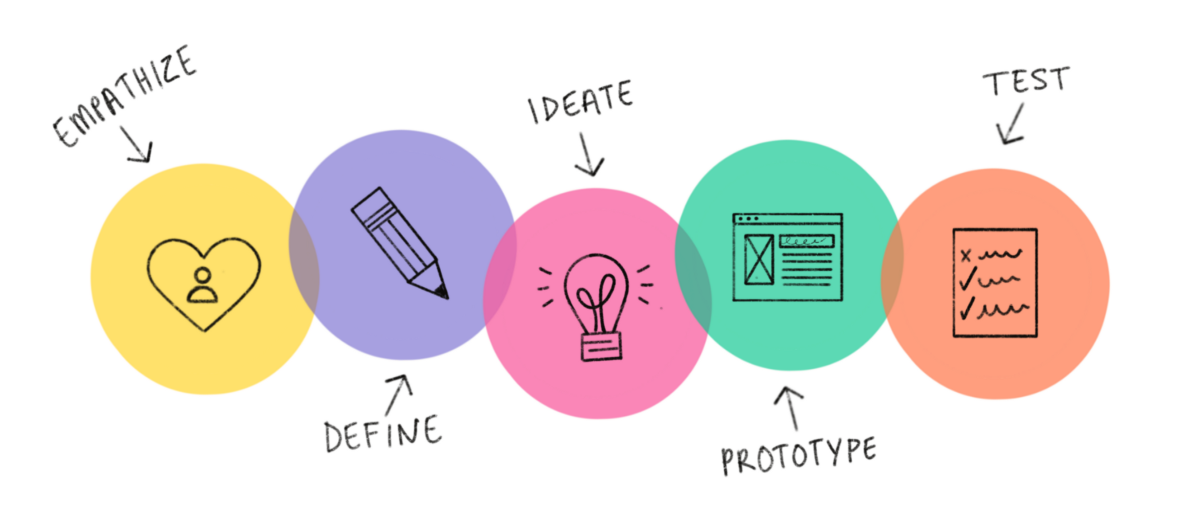
I adopt a 5-split approach when tackling a new design. I firstly start by understanding our user, where we will carry out our user research and empathise with them, in order to create a user persona, define a problem statement and create a user journey map.
My second phase is to start the ideation phase of the design, with both paper and digital wireframes and then going onto create mockups and prototypes to test out for feedback. After this, the third phase would be to refine the designs through turning our designs into prototypes and testing and the creation of a high fidelity prototype, then implementing accessibility checks and ensuring the design passes WCAG standards.
Depending on the problem statement, our goals and my particular role in the project, different projects will emphasise on certain phases more than others, such as more focus on user research and usability studies for new products that haven't been built yet, compared to a product that already has a launch whereby we have data to create insights and map from.
Design phases
Understanding our user
phase 1
- The user research carried out
- The personas we created from the gathered research
- Problem statements we designed from
- Our user journey maps
I consulted Akil and conducted interviews with some of his customers and created empathy maps to understand their needs, motives and pain points more. A primary user group identified through research was working adults who don’t always have the luxury of going to Akil's travel agency when booking a flight.
This user group stated other issues such as the current state of other flight booking apps such as being misled by cheap price advertisements, only to see these prices are only applicable for a certain group i.e. students.
Other user problems included tickets and boarding passes not being readily available via one source, some expressed motives and aspirations of having their boarding passes readily available on their phone rather than holding physical passes they would dispose of shortly after the flight.
User research: summary

Methods used: quantitative interviews, competitive audit, user journey mapping, wire-framing, prototyping and usability testing.
User research: pain points

Working adults are too busy to make their way to a travel agency to book tickets, especially when there is now emerging technologies and online booking agencies.
Time

Many tickets on current flight booking apps may display a certain price for a flight, only for many hidden costs to appear when it's time to pay, or the price may only be eligible for students or OAPs.
Misleading promo

'It would be great to have all flight information and my boarding pass in one place, I feel there's still a lot of paperwork for we who may still go to the agency.'
Disposable tickets
OUR PERSONA USED
| Goals
- To be able to book flights on the move
- Still have access. to the good flight rates provided by Akil Khan at Aki's Flights
- To have all travel related documents needed such as boarding pass to be available via her phone
| Frustrations
- “Because of the rota at work, I can't always pass by Aki's, he's such a great man and gives me the best flight prices, an app would be great, honestly.”
- "£200 for a flight to Majorca, only to click on it and see it's actually £500 for me, it's £200 for students, wish I was still studying then!'
Age: 28
Education: BsC Computing
Hometown: Bow, East London
Family: Fiance & 1 child
Occupation: Solutions Architect
Education: BsC Computing
Hometown: Bow, East London
Family: Fiance & 1 child
Occupation: Solutions Architect
Funmi is a Solutions Architect who works on an inconsistent rota, where her days off work shift quite a bit. Due to this and her family responsibilities, it’s quite difficult to travel to her local travel agent to check for good getaways, so she sometimes resorts to using other flight booking systems. She loves the prices and offers she gets from Aki's Flights as it's not common to find these sort of deals online. She also has aspirations of having all travel documents in one place, for example, her boarding pass being accessible on her phone when travelling, rather than wasting paper.
| Bio
"
-Funmi
"£200 for a flight to Majorca, only to click on it and see it's actually £500 for me, it's £200 for students, wish I was still studying then!'
Starting the design
phase 2
- Paper wireframes
- Digital wireframes
- Low-fidelity prototype
- Usability studies
paper wireframes
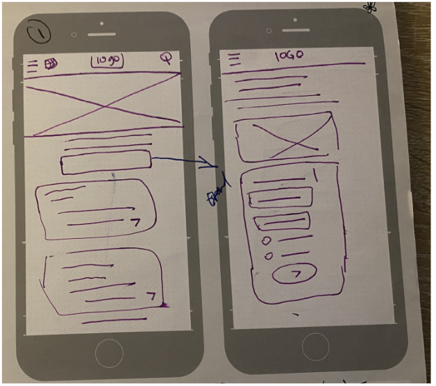
To ensure each screen of the app on paper had elements that are well-suited to address user pain points, I took my time to draft iterations of each screen.
For the home screen, I prioritised a quick and easy display of navigation and the 4 main forms of transportation and accommodation that Akil's Flights provide, which are flights, cars, trains and hotels.
For the home screen, I prioritised a quick and easy display of navigation and the 4 main forms of transportation and accommodation that Akil's Flights provide, which are flights, cars, trains and hotels.
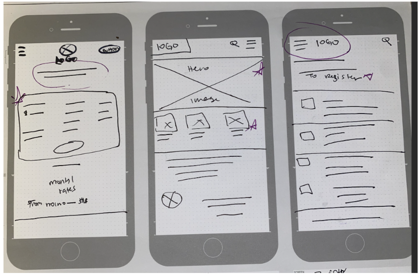
digital wireframes
As the initial design phase continued, I made sure to base screen designs on feedback and findings from the user research.
We will provide the option of return flight or one-way, with the selection of the amount of passengers.
The outbound and return flight will be selected from here also
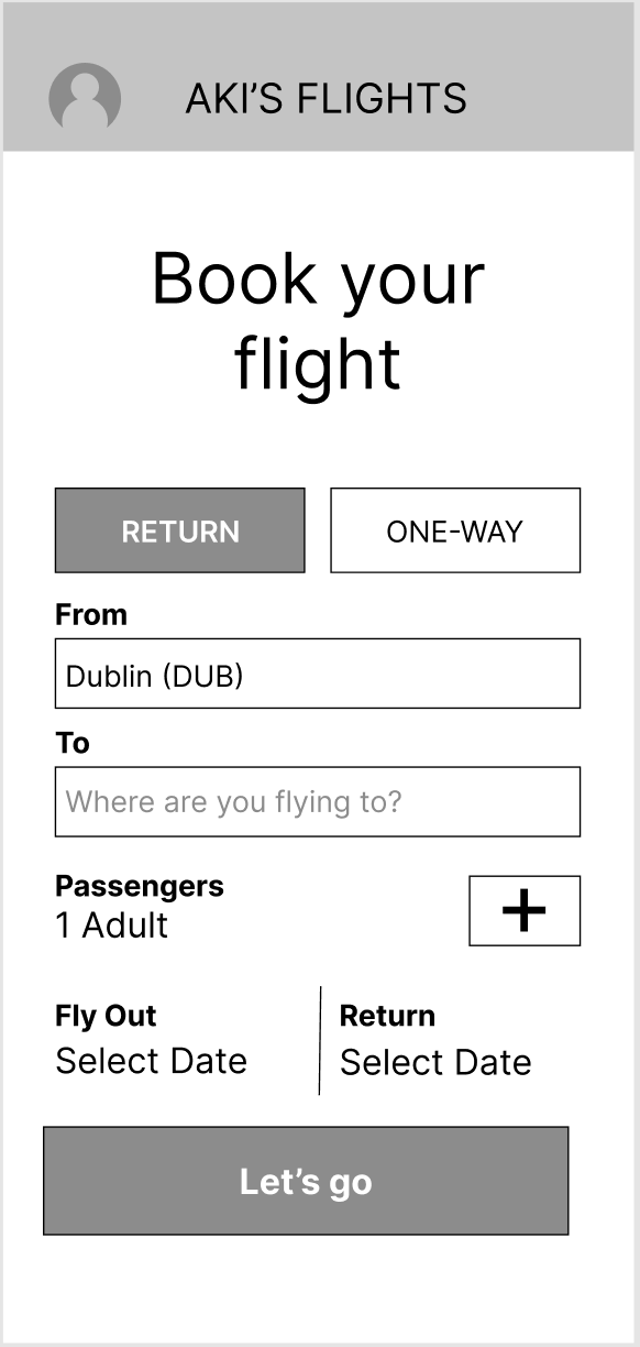
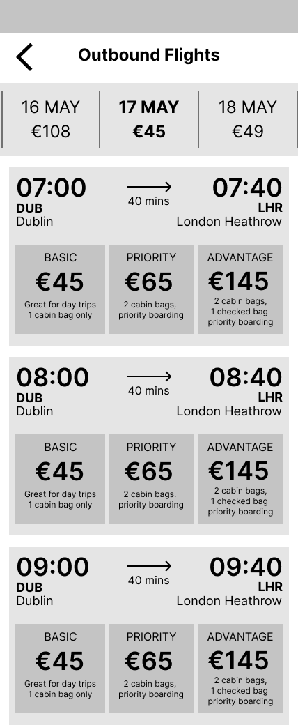
Being able to book a flight with ease and for the pricing to not be misleading was a priority, so I ensured any stipulation to pricing would not happen and the price displayed would be the same when booking, minus the few charges i.e. booking fee.
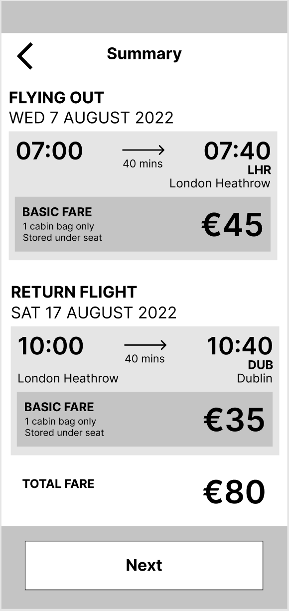
This interface will show the summary of the flight selected and the pricing.
Low-fidelity prototype
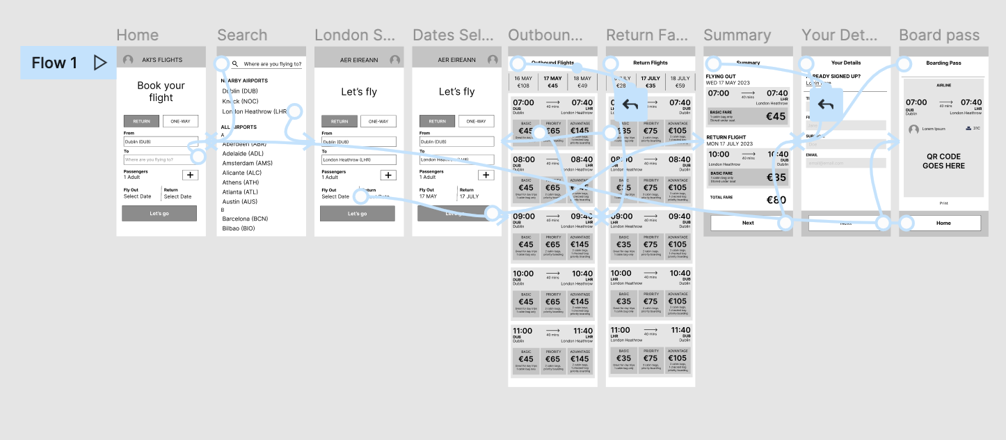
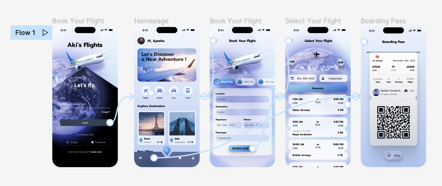
Using the completed set of digital wireframes, I created a low-fidelity prototype. The primary user flow I connected was booking a return flight from London to Dublin, so the prototype could be used in a usability study.
View the Aki's Flight App
low-fidelity prototype
View the Aki's Flight App
low-fidelity prototype
Usability study: findings
I conducted two rounds of usability studies. Findings from the first study helped guide the designs from wireframes to mockups. The second study used a high-fidelity prototype and revealed what aspects of the mockups needed refining.

Round 2 findings
Round 1 findings

Users complained that the interface of selecting both outbound and returning flights were a bit 'cluttered', making it harder to make the decision on tickets.

Users claimed that finding the class of flight was difficult and would not have known how to change this from the options given via the prototype.

One of our research participants quoted, 'What if I have a multi-city flight, there is no option for that here?'.

More than 2 of our participants re-iterated on the fact of having to log in before proceeding, which was 'tedious'.
Refining the design
phase 3
- Mockups
- High-fidelity prototype
- Accessibility
mockups
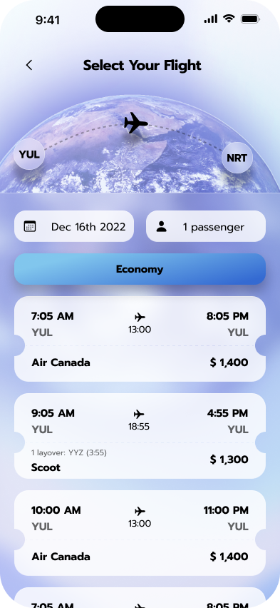
The main pain points were addressed in our mockups after the studies, with the main one here from the flight selection interface being too cluttered. I adopted a flight ticket interface approach to make the design more familiar with our users. The class of the flight also wasn't too clear, so I made sure it was a clear call to action above the flight options, where it reads, 'Economy'. I also made sure the date is easily accessible, to save the user time and not having to go back to the previous screen to change it. They may want to do this to compare prices of earlier and later flights.
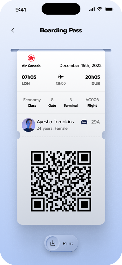
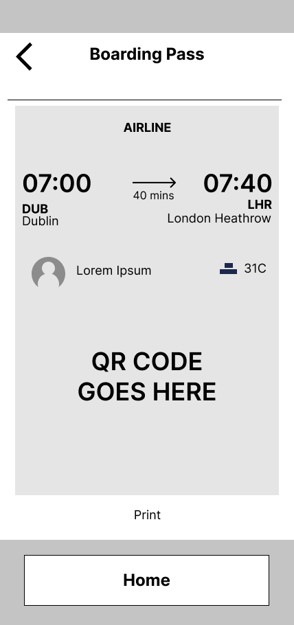
One of our initial user insights was the lack of centralisation of travel documents and how it can be a waste of paper having to travel around with printed boarding passes. It was in the aspirations of the user that the boarding pass should be available on Akil's Flight app after purchase of the ticket.
We kept to the ticket style design to ensure familiarity and globally recognised connotations, which makes our user feel at ease to know the function of this feature without much explanation.
We kept to the ticket style design to ensure familiarity and globally recognised connotations, which makes our user feel at ease to know the function of this feature without much explanation.
After usability studies
Before usability studies
After usability study 2
Before usability study 2
High-fidelity prototype and key screens
The final high-fidelity prototype presented cleaner user flows and UI elements, as i implemented more flight/airline concept based iconography and imagery. This was just the key screens need to present the main user flow, but all completed screens were presented to the relevant teams, such as the journey for selecting a hotel or choosing a destination to explore.
View the Aki's Flights App
high-fidelity prototype
View the Aki's Flights App
high-fidelity prototype
Accessibility considerations

Ensured all components passed WCAG AAA accessibility test.

Used clear imagery for the flight options and boarding passes that the users will be very familiar with.

Provided access
to users who are vision impaired through adding alt text to images for screen readers.
to users who are vision impaired through adding alt text to images for screen readers.

Used globally recognised icons and imagery to help make navigation easier.
Going forward
final phase
- Takeaways
- Next steps
Impact:
Akil and team continue to express their gratitude towards us and how this app has opened them to a world of new customers whilst keeping their current customers satisfied.
A quote from peer feedback:
"It's an efficient app, I think it will keep Akil's running a lot longer and challenge all the other websites out there that are charging us an arm and a leg for a cocktail and some sun!.
What I learned:
With the emerging technologies such as e-commerce in the travel industry, it was interesting to understand the pain points and struggles of people who still use travel agent branches and their new understanding of flight booking systems. Some were unaware of how apps can save them the trouble of having to make the trip.
I also learned that designer bias can very easily be implemented into a design if user research isn't thoroughly done; upon taking on this project, some of the ideas I had and wanted to deploy would not have met the needs of our users, so they had to be pushed back on in order for us to answer the problem statement.
Takeaways
We will conduct another few rounds of usability studies to validate whether the pain points users experienced have been effectively addressed and to see if new pain points arise for us to address and solve.
next steps

Thank you for your time reviewing my work! If you’d like to see more, feel free to browse my projects below or get in touch with me by simply clicking here.
